 Step1:
 Drag my reference picture into the illustrator and adjust its size using transform so that it fits the A3 paper.
 Step2:
 To makes thing easier, i used live trace to trace the outline so that i can draw according to it. Changed the background into template and dimmed the image to 50%.


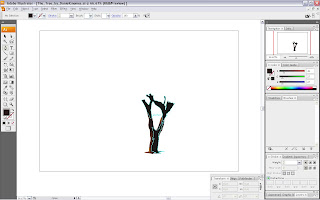 Step3:
 I created 3 layers which are treetrunk1, treetrunk2 and treetrunk3 for this part. I used pen tool to draw the outline of the tree trunk and later on colored it after it is finished. The tree trunk is separated into 3 layers to make it more realistic and more lively. Some parts of the tree trunk can be ignored because it will be covered by the upper layer.


 Step4:
 I created 3 layers for the leaves too which are leaves1, leaves2 and leaves3. Using the same method which is pen tool to draw the outline of the leaves which is time consuming =.=. As what i mentioned in step 3, i ignored some parts of the leaves as it be be overlap by the other layers so it saves some time.

 Step5:
 After completing the whole tree, i carry on to the ground. I created 2 layers for the ground which are named under land1 and land2. Once again, i used pen tool to draw all those little parts of the shadow and the frame.
 Step6:
 This is the easy one! I created only 1 layer for the mountain behind named under mountain1 and using pen tool... again...
 Step7:
 Layer sky1 and sky2 were created after i had done all those major/minor editing of the tree. I used gradient tool to color the sky using peach instead of blue which I THINK is more suitable. Just IGNORE the msn thingy...
 Step8:
 Lastly, the logo was added. I used a rectangle with 40% opacity to separate the logo with the background so that they won't mix together.
Step9: CELEBRATE and
SLEEP.
.jpg)


