Monday, September 8, 2008

FINAL FINAL FINAL!


DESIGN

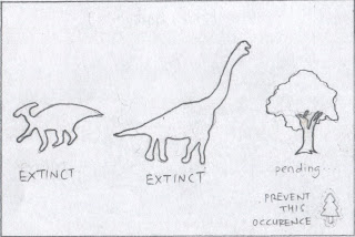
The title of my assignment is HOPE or Pain, and the message that I am trying to deliver is "PREVENT this occurrence".

My statement is trying to warn the public not to cut trees down to prevent the trees from extinction. The quantity of tree is decreasing rapidly and is in the pending list of extinction and action need to be taken seriously.

I arranged the 3 objects in a horizontal way just to make it look more harmony and tidy.
The 2 dinosaurs are on the left because it shows the sequence from left to right, which is the process of extinction. The tree is in the pending list of extinction and is placed on the right hand side to show how serious deforestation is.

The color i used for the background is a yellowish-brown which represent HOPE and make the objects in front more contrast and outstanding. The texture of the background is a little bit rough and dirty to bring out the old and retro feel to show extinction.

The dinosaurs are in gray scale and a little bit transparency to give the feeling of hopeless and extinction. Where as the tree is more solid and in sharp, eye catching color to attract people's attention and aware about the crisis of deforestation.

Assignment 3 again. processessssssssssss

I had some problem with my previous poster and things just went crazy!
so, to prevent unpleasant things from happening,
I decided to redo my assignment 3.
I AM SO FRUSTRATED days ago.. haha


So, this is the 1 i decided to go with.


STEP 1: Get the mamenchisaurus ready and started drawing its outline using pen tool.


STEP 2: To make it more realistic, I used pen tool to draw the shadows on its body.


STEP 3: I used 3 types of gray to give the mamenchisaurus some tone so it would probably looks more attractive.


STEP 4: I am not satisfy with the outcome so i added more details using pen tool. #.#


STEP 5: I am done with the mamenchisaurus and now i m dealing with T-REX! woo hoo! I used the same tool which is pen tool to draw the outline of the t-rex.


STEP 6: Finished drawing the whole thing and it coloring time! I colored T-rex according to my reference which is peach, light brown and dark brown.


STEP 7: And again, too less details on t-rex makes it looks like a plasticine so i added alot of strips all over it body using pen tool.


STEP 8: DONE with the 2 dinosaurs and I am exhausted. =.= No time to waste so i started my background. I used gradient tool and scribbled it to give it a messy look.


STEP 9: I found the background a little bit too dull so i reduced its opacity and added another layer with low opacity on it.


STEP 10: The background is full of holes which annoyed me so i added the third layer with POLKA DOTS. I think it matched the color of my background so i don't mind using it.


STEP 11: I am still not satisfy with it so i added more layers with different gradient and opacity on it to enrich its color.


STEP 12: The previous color was too dark and i think it brings out a hopeless message so i decided to add a layer of yellow with 21% opacity on it to make it brighter.


STEP 13: This is the final background and i think I am not going to make any changes so i trimmed it using the very lame way. I created a new layer and put white rectangles all around the layout to cover the mess up. (clipping mask just does not work...)


STEP 14: Dragged the mamenchisaurus over and placed it in the middle of the poster.


STEP 15: Dragged the t-rex beside the mamenchisaurus. To bring out the meaning of extinction, I set the opacity of the 2 dinosaurs to 70% to show the fade out effect.


STEP 16: Dragged the tree from my assignment 2 and placed it on the right hand side.


STEP 17: After adjusting the size of the tree and the dinosaurs to an appropriate size, i placed the logo at the bottom right.


STEP 18: Lastly, i typed my message using type tool which is "PREVENT this occurrence" and its subline "for the sake of our next generation". I added the columns to the tree and dinosaur with words inside which is EXTINCT for the dinosaurs and PENDING... for the tree to bring out the rapid decrease of quantity of trees on earth.

Sunday, September 7, 2008

Assignment 3. processessssssssssss

I had chose the sketch with the cityscape as my final.
so,
here we go again.


STEP 1: Draw the outline of the city using pen tool.


STEP 2: I wanted to bring a hopeless feel so i chose gray for the color for the buildings.


STEP 3: The building looks a little bit stiff so i use feather to make it looks softer.


STEP 4: Draw the lights of the city using pen tool and rectangle tool.


STEP 5: Fill the empty boxes with striking yellow color to light up the lights. haha.


STEP 6: I use round corners tool to touch up a little bit to make the lights look softer. To make them more realistic, i use the outer glow effect to lighten up the lights.


STEP 7: Was not satisfy with the lights so i delete quite a amount of lights and resize most of them. I think they looks better now.


STEP 8: Copy the whole city and paste it in a new layer named "reflection". I reflect the city for the reflection on water. (i don't think i need to mention this. @@)


STEP 9: I reduce the opacity of the reflection from 100% to 73%. Now it does looks like a reflection.


STEP 10: The reflection is a bit unnatural to me so i scribbled it. It a bit more convincing now.


STEP 11: After i have done with the cityscape and reflection, i go on to the sky part. I use gradient tool to make it more natural.


STEP 12: I find the sky a little bit too dull so i add the light source using flare tool.


STEP 13: Next is the water where the reflection falls. Same as the sky, i used gradient tool to color the water.


STEP 14: The water is too flat for my liking so i scribble it just like the reflection of the cityscape.


STEP 15: The message for the poster is "PREVENT this occurrence". I use the type tool to insert the message into the poster.


STEP 16: I wanted to give a twist to the message so i build the message using few layers with different opacity. I choose red color for the fonts to make it stand out from the dark background


STEP 17: I import the tree from my assignment 2 and place it in the middle of the city. I am trying to deliver the message :" This is the only tree left in the city, do you really want this to happen?" haha.


STEP 18: I copy and paste and reflect the tree in the same layer . And again, i scribble the reflection of the tree.


STEP 19: I don't like the previous font so i changed it into another font. The red is too awkward so i take away the red and replace with orange. I applied an effect to the words to make it look nicer.


STEP 20: After all the work, i added my logo to the poster. ^^


STEP 21: I am not satisfy with the brightness of the poster so i created a layer with gray gradient to place on top of the poster. I reduce the opacity of this layer from 100% to 30% so that it is not too obvious.


STEP 22: There are too many lines outside the page so i tidy them up by overlapping blocks of white rectangle on them.


STEP 23: I think my message wasn't strong enough so i added another sub line to it which is "for the sake of our next generation" to make it complete.

STEP 24: CLAP, SHOUT, and JUMP in happiness.

references UP

These are my references for my assignment 3.


i heart the typo of this poster but not the illustration. :p


the tree and the composition is nice. it matches with one of my sketch.


SIMPLICITY! but since this is cg class, i think this wouldn't work.


one of my sketch has some cityscape going on, so i surfed the net for some nice cityscape photos and illustration to make things easier.

all references from http://www.deviantart.com/